Unordered List

Showing posts with label costume design. Show all posts

Thursday, 24 March 2016

Rationalizing Wonder Woman's Amazon costumes


Entertainment Weekly just posted the first pic from the new Wonder Woman movie, and it's stressing me out because I'm worried these ladies are gonna get stabbed in the junk.


The way I see it, there are two options here:

  1. Wonder Woman and friends are sword-proof and invulnerable, and the armor is just a fashion choice.
  2. The armor is "real," but inexplicably exposes everyone to lethal blows to the neck, arms, and upper thighs.
Now, I'm the first to admit that there's no such thing as a ~practical superhero costume. Their job is to look cool and distinctive, not to make perfect rational sense. Unfortunately for Wonder Woman, her wardrobe choices are colored by decades of sexist garbage movies where women wear skimpy outfits to satisfy our old friend the Male Gaze. In that context, this photo could probably benefit from... some pants, basically. Maybe just one woman wearing pants. 

Analysing ~sexualized movie costumes is a real can of worms, because you very quickly become embroiled in the issue of shaming real women for their fashion choices. However, there's a very big difference between a real person deciding to wear a strapless metal bathing suit (do what thou wilt!) and a movie studio marketing its first female action hero in the same kind of outfit. These costumes do not exist in a cultural vacuum.

Saturday, 25 July 2015

Ant-Man: Fun, but still a waste of $130 million.

Following this film's much-discussed behind-the-scenes meltdown, my expectations were low. So I was pleasantly surprised to discover that Ant-Man is a decent movie, if not a particularly interesting one. At the very least, it was more coherent than Age of Ultron.

Both movies were the product of embarrassingly public disputes between their directors and Marvel Studios, but Ant-Man managed to resolve itself into an entertaining (if lightweight) heist movie while AoU was a mess of conflicting subplots and franchise tie-ins: Joss Whedon's weird Black Widow issues and inconsistent characterization vs. Marvel's obsession with clumsy sequel foreshadowing. You could pick out certain scenes in Ant-Man that felt like Edgar Wright's work, but it didn't feel patchy like Thor's bizarre cave-swimming subplot did in Age of Ultron.


Ant-Man and the Marvel Cinematic Universe

More than any other MCU movie so far, Ant-Man captured the tone of a solo comic in a larger fictional universe: casually acknowledging the existence of other superheroes without going for an actual team-up. We've now reached the point where the MCU is big enough to support cameos from familiar side-characters without it seeming forced, which is great for worldbuilding purposes. It's just too bad this only happened after the departure of Edgar Wright, who wanted to make a standalone movie with (presumably) a more esoteric tone.

Ideally, Marvel should find a happy medium between franchise crossover moments and allowing filmmakers more freedom to make a personal mark. That's why comics like Ms Marvel and Hawkeye are so popular: they have a memorable sense of personality.

Monday, 1 June 2015

INTERVIEW: "Mad Max: Fury Road" costume designer Jenny Beavan

Previously: My review of Mad Max: Fury Road

The Mad Max series boasts some of the most influential costumes in sc-if/fantasy cinema, kick-starting a trend for post-apocalyptic fetish punk that inspired numerous movies, music videos and outlandish outfits at Burning Man.

Oscar winning costume designer Jenny Beavan was brought in to develop the look of Fury Road, a far cry from her best-known work on historical dramas like The King's Speech and Sense and Sensibility. The result was a fresh new aesthetic that blends grimy realism with the kind of memorable extremes we've come to expect from a Mad Max movie.

Just as director George Miller's attention to detail led to the most exciting movie in the franchise, Jenny Beavan's costumes were the most technically ambitious and character-driven so far. Happily for me, she agreed to an interview about her experiences on the film, discussing the vision behind Fury Road's costumes.


HelloTailor: One of the fascinating things about Fury Road is the way George Miller worked from a 3,500 panel storyboard instead of a traditional script. Did you collaborate with [concept artist] Brendan McCarthy on the character designs, or did you get started after his storyboard was complete?

Jenny Beavan: No, I didn’t have any collaboration with Brendan McCarthy - but I did meet him when he visited Namibia, which was exciting. I came on board relatively late in the proceedings, considering the project had been prepping for some 12 years I think!

The earlier Mad Max movies have a really iconic post-apocalyptic look. How did you balance the references to Norma Moriceau's Mad Max costumes with the new aesthetic for Fury Road?

Mad Max: Fury Road was absolutely a continuation of the Mad Max genre and at the same time completely different - if that makes sense. We are in the same and a completely different wasteland, and with a lot of new characters. Because George Miller is the genius behind all the films there will always be a certain continuity, as it is his vision we were all creating.

Sunday, 18 January 2015

Interview: Agent Carter costume designer Gigi Melton

Previously: A guide to the 1940s costume design of Agent Carter

Agent Carter combines so many of my favorite things: comicbook adventures, a complex female protagonist, 1940s spy hijinks and, of course, beautiful costumes and set design. The post-war setting is a fascinating period to explore from a fashion history perspective, and I was happy to see that all of the costumes have a strong characterization element as well.

Costume designer Giovanna "Gigi" Melton caught my attention on Twitter with her many behind-the-scenes posts about her work on Agent Carter, and she was kind enough to grant me an interview. Read on for more background on the amazing costumes in this show, plus a selection of Melton's original design sketches.


HelloTailor: How did you go about researching and designing the overall look for the show? Were you influenced by any of the comics, or was it more a matter of exploring the 1940s aesthetic?

Gigi Melton: A combination of much research.  For Peggy the influences were Lauren Bacall, Katherine Hepburn, Hedy Lamarr. The smart, strong, fashionable and beautiful women of the era.


For SSR [Strategic Scientific Reserve] agents Dooley, Thompson, Sousa, and Krzmenski I researched government and detective looks. For eccentric Stark it was Howard Hughes and for Jarvis it was a British nod to tweeds. Coupled with comic book research, I took all of my inspiration and tailored it to create the individual looks for the scripted characters.

Friday, 16 January 2015

Behind the seams of the Oscars' costume design category

The Oscar nominees were announced yesterday, and of course I was compelled to write about the costume design category. Specifically, my frustration regarding the kind of films that are routinely ignored, year after year.

Do all of the designers on this list deserve to be nominated? Well, yes. They're all brilliant, and did great work on the films in question. But the selection process for this category is still deeply flawed, and fails to represent the range of talent on offer.


As Roger Ebert pointed out in his unwritten rules of the Oscars, the Academy rarely gives out awards for subtlety. "It never hurts to ask yourself," he wrote, "Who did the 'most' acting? Most editing? Most noticeable cinematography or music?"
In the costume category, this is truer than ever. The award invariably goes to the film with the most impressive and noticeable costumes, whether this means creating a selection of historically accurate crinolines or outfitting an army of elves.
Two ingredients are required for an Oscar nomination in costume design. First, it's helpful to be a familiar face who has been nominated several times before. Secondly, you need to have worked on a historical drama (preferably starring Keira Knightley), a sci-fi/fantasy epic, or a musical—the three genres that produce the most showy and memorable costumes.
Judging by these two criteria, this year's nominees are comfortably predictable.
[READ MORE]

Tuesday, 6 January 2015

A guide to 1940s costume design in Marvel's Agent Carter

Marvel's Agent Carter begins tonight, and I wrote this Daily Dot article to coincide with the first episode. It's a spoiler-free background for Peggy Carter's costumes, and why the show is set during such an interesting period in fashion history.

Set in 1946, Agent Carter's seven-part espionage story is rooted in postwar culture. And like the first Captain America movie, one of its defining features is its 1940s aesthetic, immediately setting it apart from Marvel's other TV show, Agents of S.H.I.E.L.D.
The biggest influence on Western fashion in 1946 was, obviously, World War II. Fabric rationing led to a trend for simpler clothes, and women's fashions suddenly became more practical due to the influx of women joining the workforce—like Peggy Carter, whose career began in the Strategic Scientific Reserve during the war. These factors added up to women wearing low heels and plain, knee-length skirts without pleats or frills, and men wearing suits without cuffs or flaps on the pockets. 
Agent Carter takes place during a dynamic period in fashion history, the transition from wartime austerity to the postwar styles that would define the 1950s. By 1947 the French fashion industry was up and running again, and Christian Dior introduced the so-called "New Look" of nipped-in waists and flouncy calf-length skirts.

Sunday, 28 December 2014

Mockingjay and Costume Design: Real or not Real?


In terms of costume design, first two Hunger Games movies never quite lived up to my expectations. It wasn't that the costumes were bad -- far from it -- but they seemed far too homogeneous. Given free rein to create the most outlandish designs imaginable, the Capitol fashjons were disappointingly conservative and homogeneous.

Mockingjay, Part 1 was another matter entirely. With no Hunger Games, Capitol makeovers, or District 12, the story focused on Panem's growing revolution, shown through the eyes of the propaganda war between the Capitol and District 13. Before the film even came out, YouTube propaganda clips began to illustrate the calculated nature of President Snow's public image.


Mockingjay flipped the cliché of dark and light, with the villainous President Snow surrounding himself with pure white to match his signature white roses. His brainwashed prisoners Peeta (dressed in an uncharacteristically stiff suit and a painful-looking white paper collar) and Johanna presented a united front, fitting in with Snow's clean, luxurious aesthetic. Meanwhile Katniss, daughter of coal miners, wears black body armour and fatigues.

In the earlier films, this kind of contrast was meant to highlight Katniss's salt-of-the-earth nature with Snow's obsessively controlled image, but this time it's more complex. Katniss may look more practical and less "styled" than Snow and his entourage, but that's because her District 13 stylists decided this was the best way to market her to the rebels. Her Mockingjay armor (in real life, modeled off a Japanese archery breastplate) was designed for her by Cinna, and continues the asymmetrical theme of previous outfits she wore to public appearances.

Sunday, 9 November 2014

Interstellar, costume design, and the difficulties of "realistic" visual worldbuilding.


Interstellar is one of those movies where the costume design is almost invisible, which is part of what makes it so interesting. The simplest explanation is that the visual style is purposefully "realistic" and avoids any kind of futurism... which in itself is unrealistic. A conundrum, right? Technically, it doesn't make sense for people 50-100 years in the future to wear the same clothes as people in 2014. But from the perspective of a filmmaker who wants his apocalyptic sci-fi film to be taken seriously, this aesthetic decision makes perfect sense.


The earthbound setting of Interstellar is a classic American fantasy: a manly farmer hero, raising his kids in a bleak, rural landscape. Despite the film's image as a deep and thoughtful space epic, it still relies on the familiar old Hollywood scenario of a messianic white American dude being the one person who can save mankind. (And yes, I know his daughter does the actual saving, but this is very much a film about Cooper, not Murphy.) Underdog heroes NASA and Matthew McConaughey save humanity while the rest of the world is apparently helpless. Politically and socially, this is a tired old trope, but it aligns well with the kind of generic hero that can be inserted into a complex movie with minimal exposition. Cooper is the kind of guy who, for better or worse, is perceived as "universal." Luckily, McConaughey's performance was brilliant.

So here we have Coop and his kids, looking both relatable and realistic in their jeans and hoodies. This is the difference between a meticulously researched film that is actually realistic, and a film whose worldbuilding gives the appearance of realism, and therefore does not jolt viewers out of their comfort zone. On the whole, the appearance of realism tends to be the better choice. We're watching fiction, after all.

Friday, 10 October 2014

Schedule for Seattle Geek Girl Con this weekend

I’m in Seattle for Geek Girl Con this weekend! I’m doing two panels and a talk about superhero costumes — please come along! :D Here’s my schedule. (The superhero costume design talk is probably the most relevant to people who read this blog: 3pm on Sunday in room LL2.)
SATURDAY
3pm: “21st Century Boys: Slash in the Mainstream”
“Today, male/male slash is the predominant form of ‘shipping in online fandom. Growth of slash and femslash has spawned new problems: exploitation of ‘shipping by media; the push to make fanfic “publishable”; and the ongoing struggle to translate fandom’s feminism, diversity, and push for queer pairings into increased media representation.”
5pm: “Fandom and the Media”
This panel is basically me and several other fandom/geek culture journalists (Lauren Orsini, Aja Romano, Versha Sharma, Lisa Granshaw and Amanda Brennan) discussing our experiences in the field, and talking about what it’s like to report on fandom news when you yourself are a fan.
SUNDAY
3pm: “Evolution of the Superhero Movie Costume”
I’m doing a 45-minute talk about how superhero movie costumes have developed over the years, and why. If you like my blog posts about superhero movies, hopefully you’ll enjoy this! 

Monday, 22 September 2014

Costuming and Design in Captain America: The Winter Soldier -- Nick Fury, Black Widow, and S.H.I.E.L.D.

Part 1: "Trust No One" -- How Captain America became the gritty superhero we never knew we wanted.
Part 2: HYDRA, Sitwell, and diversity in the Marvel universe.
Part 3: Black Widow and Falcon. 
Part 4: The Tragedy of Bucky Barnes.
Part 5: Worldbuilding in the MCU
Part 6: Costuming and design: Steve & Bucky.

People love to namecheck spandex when talking about superhero costumes, but as far as I recall there's no spandex to be seen anywhere in the Marvel Cinematic Universe. With Cap's costume toned down to a subtle navy blue for Captain America: The Winter Soldier, the most comicbook-looking character we see is Nick Fury.

With each new appearance, I've grown to love Nick Fury's costumes more and more. Not just because they look cool, but because of the internal logic of why he dresses like that. To understand what I'm getting at here, take a moment to think about S.H.I.E.L.D. itself, and Fury's role within the organization.


In The Avengers, Agents of S.H.I.E.L.D. and other Marvel movies, S.H.I.E.L.D. is portrayed as a quasi-governmental Men in Black organization. It's populated by military types, agents like Coulson, jumpsuit-wearing Helicarrier personnel, and a smattering of individuals like Black Widow and Hawkeye. Fury is in charge, with Maria Hill as the deputy director and Alexander Pierce as his immediate superior, a kind of liaison between S.H.I.E.L.D. and various world governments.

Up until now Fury was the authority figure, a character who swoops in and solves problems or tells the heroes what to do. He was basically a trigger-happy, morally ambiguous Gandalf figure.

CATWS brought in a much-needed new dimension of fallibility to Nick Fury, as well as showing him inside S.H.I.E.L.D. headquarters for the first time. Alexander Pierce, in his old-fashioned but stylish three-piece suits, both fits in with those surroundings and represents the political establishment. Meanwhile Fury, with his ostentatious black leather outfits, does not exactly seem like he belongs in a grey office building.


There's a certain internal consistency to the costumes at S.H.I.E.L.D., with Maria Hill and most of the Helicarrier personnel wearing navy blue uniforms (the same shade as Cap's new uniform and his nylon biker jacket in this movie, incidentally), and characters like Coulson and Agent 13 wearing subdued businesswear.

Nick Fury does not fall into either category. He's sure as hell not wearing normal clothes that could blend into his surroundings, and I highly doubt that his outfits adhere to S.H.I.E.L.D.'s official uniform. Instead, I can only describe his favourite costume as some kind of supervillain-themed black leather cosplay outfit.

Yes, Nick Fury is a goth.

Sunday, 31 August 2014

Doctor Who: The Doctor's new outfit, and some thoughts on female companions and costume design.

The unveiling of a new Doctor Who costume is a lot like a superhero rebranding -- or a new collection by an established fashion label. It's a combined attempt to get people excited about innovation, while reassuring everyone that not too much has changed. And so, the BBC announced Capaldi's new costume by talking about how it blends elements of old and new -- for example, the visual callback to John Pertwee's costume.


Thanks to the age gap between Capaldi and Matt Smith, the whole "old vs. new" thing is specifically relevant to this regeneration. Smith was dressed in an almost grandfatherly way (tweed, bow tie and braces), but that had the side-effect of making him look like a hipster. This was problematic because the Doctor's costume should never resemble a current fashion trend.

If you can look at the Doctor and say, "That guy looks like he should be hanging out in a vintage shoe shop in 21st century Hackney," then it detracts from his image as an alien -- although of course, if you make him look too alien then you can't take him seriously. Capaldi's costume sidesteps this issue by being extremely simple and pared-down, which I enjoy a great deal (not least because I want to wear the entire outfit myself).


Looking at Clara and the Doctor in the first episode of season 8, the similarities between their two outfits are obvious. He's wearing a white shirt with a prominent collar and no tie, in a more severe version of Clara's lace collar. Then there's the black/white/red color palette, and the fact that he's wearing a cardigan rather than a waistcoat underneath his jacket. If you wanted, you could probably even stretch to linking Clara's tartan skirt to the fact that Twelve has a Scottish accent.


To me, this link between the Doctor and Clara's clothes is a clear sign that intentionally or otherwise, he imprinted on her after regenerating. (Although if you look at Clara's cardigan, you'll see that it's patterned with bow ties -- a callback to Eleven's signature accessory. She's still looking back to the Doctor's previous incarnation, whereas the new Doctor is calling out for her attention.

Tuesday, 29 July 2014

Interview: "Snowpiercer" costume designer Catherine George.

Following my review of Snowpiercer, I originally intended to write a post discussing the film's very striking costumes. But after looking back at some photos and clips, I was struck by how much more I wanted to learn about the process behind this film's visual design. Each section of the train had such a strong theme (filth and poverty in Tail Section; delusionally wholesome springtime pastels in the school car; opulence and luxury towards the front of the train), but nevertheless felt grounded in reality.

Happily, costume designer Catherine George agreed to an interview about her work on the film. She discussed the inspiration behind Snowpiercer's most memorable costumes, and what it was like to work with director Bong Joon-Ho and a cast including Chris Evans and Tilda Swinton.


HelloTailor: To begin with, how did first you get involved with Snowpiercer? The combination of Korean and English-language production made me curious about how you came to work on the film.


Catherine George: Director Bong had seen We Need To Talk About Kevin at Cannes in 2011, when he was on the jury, and he liked how the costumes looked. They sent me the script a couple of months later and I Skyped with Bong and and his producer Dooho because they were already in Prague prepping [for Snowpiercer]. Before I knew it, I was on a plane to Prague. Bong also met with Tilda Swinton at Cannes as they were both fans of each other’s work, and he decided to cast her as Mason -- a role that was originally written as a man.

[You can read more about the costumes of We Need To Talk About Kevin in this article by Clothes On Film.]

HelloTailor: How much did you consider the idea of finite resources onboard the train? In the Tail Section, people were wearing whatever rags they had left after 17 years. I was wondering what kind of thought went into the idea of a world where you can't really obtain new materials for new clothes. Was this a major concern when you were designing the overall look of each train car?


CG: Yes, we talked a lot about how long the passengers had been on the train, where they’d come from, what random materials they would use to fashion practical clothing. In the Tail Section, the aging and distressing was quite heavy and their clothes were made of different parts of garments pieced together. They had to improvise with whatever materials they could find. Curtis' coat had layer upon layer of repairs.

The character Painter wore a poncho made from old moving blankets. He also wore a helmet with a lantern left over from the train utility-wear, to enable him to draw in his cage at night.

Wednesday, 30 April 2014

Costuming and Design in Captain America: The Winter Soldier -- Steve & Bucky.

Part 1: "Trust No One" -- How Captain America became the gritty superhero we never knew we wanted.
Part 2: HYDRA, Sitwell, and diversity in the Marvel universe.
Part 3: Black Widow and Falcon. 
Part 4: The Tragedy of Bucky Barnes.
Part 5: Worldbuilding in the MCU.

The decision to set CATWS in Washington DC was a big departure from the visuals of the first Captain America movie. Compared to the sepia-toned beauty of The First Avenger, Steve's new life looks depressingly drab and grey. The car chases churn through DC traffic on concrete freeways, SHIELD headquarters looks like a cross between a multi-storey car park and an office block, and the Helicarriers are all cold, smooth glass and metal. The only hint of the warm colour-scheme of Steve's youth is when he goes to visit Sam Wilson at the VA, a comforting moment among the corporate cleanliness of the rest of DC.


Each Avengers movie has its own aesthetic, with Iron Man flitting between palaces of high-tech luxury, Thor living in a world of gold embossed armour and faux-historical alien weirdness, and Cap spending the entirety of his first movie surrounded by 1940s grime. CATWS was definitely the ugliest instalment in the franchise, which kind of worked in its favour because it highlighted Steve Rogers' isolation in 21st century DC.

Tuesday, 1 April 2014

Costuming and design in Hannibal: Bella Crawford, between life and death.

Previously: Costuming and design in Hannibal, Part 1, Part 2, and Part 3 (Hannibal's wrist watch.), Part 4 (Abigail Hobbs).

I already mentioned in my first Hannibal costuming post that the FBI team dress like characters in a crime procedural drama, while people like Hannibal and Bedelia du Maurier seem to come from another universe entirely. The main visual difference between the FBI lab team and your average CSI character is that they wear vanishingly few monochrome outfits.
Compared to a show like Person of Interest, where two or three main characters can be wearing all-black outfits in any one episode, Hannibal's crime-fighters look positively colourful. Beverley Katz has at least three different maroon jackets, Jack Crawford loves his dark blue and purple jewel tones, and even Price and Zeller mostly wear neutral colours like navy blue or beige. (Price is characterized by his slouchy dad outfits and cardigans, while Zeller's clothes are more youthful and flattering.)
The only character in the show who habitually wears black and white is Bella Crawford. In her first appearance in "Coquilles," she's wearing a pure white dress to a dinner party with Hannibal and her husband. In the darkness of Hannibal's dining room, she stands out immediately, and the draped style of the dress makes Gina Torres look like some kind of ancient Greek deity.

Sunday, 23 March 2014

Costuming and design in NBC's Hannibal: Abigail Hobbs

Previously: Costuming and design in Hannibal, Part 1, Part 2, and Part 3 (Hannibal's wrist watch.)

While Hannibal Lecter's suits are undoubtedly the most eyecatching costumes on the show, I found myself really warming to Abigail's costuming when rewatching season 1. Her clothes in "Potage" are particularly interesting, because they were bought for her by Alana Bloom. This means that rather than wearing her own clothes, she's actually dressed in Alana's interpretation of Abigail-clothes.

Abigail may be an emotionally fragile 17/18-year-old girl, but I'm glad to say that she's neither dressed up like a TV teen (which wouldn't remotely fit in with the overall tone of Hannibal), or styled to look more childlike and therefore ~vulnerable. Like the adult characters, she has a very specific dress sense and colour palette, which in her case is very "outdoorsy". Either she's wearing sensible hunting clothes to spend time in the forest with her father, or she's dressed in green and brown, often surrounded by natural imagery of plants and flowers. While Hannibal is a Francis Bacon painting and Will is an Edward Hopper, I think Abigail is a botanical illustration.
Screencaps via screencapped.net
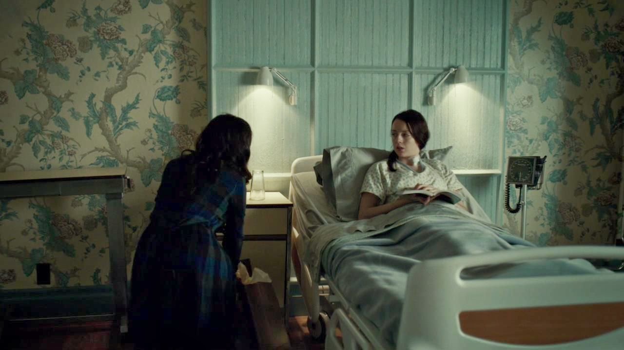
Abigail's hospital room is very serene, with her butterfly-patterned nightdress matching the pale blue-green bed linen, furniture and patterned wallpaper. This delicate floral motif is directly at odds with Freddie Lounds, who shows up wearing a leopard print dress, a red-lined cape and gloves. Freddie looks practically Disney villainesque in her predatory role as Abigail's unwelcome visitor, and is the one central character in the episode who isn't wearing an outfit that fits in with Abigail's colour palette.

Wednesday, 19 March 2014

Costuming & design in NBC's Hannibal: Hannibal Lecter's wristwatch.

As part of my ongoing series on costume and design in Hannibal, I'm going to post my first guest blog with contributions from an outside writer. My brother is a watchmaker and an avid fan of Hannibal, and recently mentioned to me that he had some thoughts on Hannibal's watch in the show (a $176,300 white gold Patek Phillippe 5270G Chronograph, apparently). Here's what he had to say:
via weartherude
Patek Phillippe are generally seen by most watch people as the big brand leaders. They have an extremely prestigious rep, although reputation is very, very weird with watches. It doesn't just vary by brand but also by model. The Rolex worn by a particular James Bond in a particular Bond movie may be seen as some amazing piece of art, but a gold-cased Rolex of the same model but a different year could be trash. To give you an idea of Patek Phillippe's marketing brand, here's a recent advert:

Tuesday, 18 March 2014

Costumes and design in NBC's Hannibal, Part 2.

Previously: Part 1

Rewatching the first few episodes so close together, I quickly began to notice the many instances where characters are wearing colours that either match or complement each other. Part of the reason I picked up on this is because the transition between the pilot ("Aperitif") and second episode ("Amuse-Bouche") is so noticeable.

In "Aperitif" there's still no overarching colour scheme linking the cast together, but as soon as Hannibal switches from his normal-person disguise of beige and brown sweaters to his own "real" clothing in episode two, everything begins to come together. After this, there are moments in every episode where certain characters are seen wearing complementary outfits or somehow fit in with the colour scheme of their surroundings. This is surely no accident, either as an aesthetic choice or as one of the many moments of visual symbolism in the show.
Before we move onto the rest of the season, I'd just like to spend a moment on Hannibal's uncharacteristically bland outfits in "Aperitif." Someone else has already written about Franklyn's habit of "mirroring" Hannibal's dress sense so I won't go into too much detail here, but as Hannibal's most obsessive patient, it's possible to theorise that Franklyn is attempting to copy Hannibal's style. There are several scenes throughout the series where we see Franklyn wearing layered outfits and "loud" ties that seem like a pale simulacrum of Hannibal's costumes, but in the instance of "Aperitif," I think the reverse may be true: Hannibal is mirroring Franklyn.
Screencaps from screencapped.net

Tuesday, 11 March 2014

Costumes and design in NBC's Hannibal, Part 1.

I probably should've been writing about the costumes of Hannibal from the very start, but I confess to feeling a little overwhelmed. The quality of the costume design (and set design, and food design, and soundtrack...) in Hannibal is so incredible that not only does every episode deserve its own post, but lots of other people have already been analysing it since day one. Is there even room for another reviewer? But as luck would have it, I just moved in with someone who has never seen the show, and we decided to watch season 1 from the beginning. I can now verify that it's one of those rare TV shows whose rich detail means that it actually improves when you watch it for a second time.
In "Aperitif," Hannibal's costumes are far more varied than in later episodes, mostly because he's wearing a kind of everyday camouflage half the time. A more literal version of what Bedelia du Maurier refers to as his "people suit," if you will.

At home and in his own office, we see Hannibal in his typical uniform of luxurious three-piece suits. But whenever he has to go to the FBI, he wears what basically amounts to normal-person drag: a scruffy blazer, brown sweater, and unbuttoned shirt. The colours complement each other, but it isn't the kind of daring fashion choice we see him making in most other scenarios. I suspect this was him testing the waters at the FBI, attempting to fade into the background until he's scoped things out. Hannibal doesn't actually make much effort to disguise his eccentricities in day-to-day life, but he does ease people into them. That's how he gets away with making so many cannibalism puns during his dinner parties, I suppose. But while Hannibal's uncharacteristically scruffy FBI outfit was something I noticed when I first watched this episode, the moment that I found most visually arresting this time round was his first appearance onscreen.
The first thing we see from Hannibal Lecter is his hands, cutting into some meat as he eats alone in the dark of his house. Virtually all reviews of Hannibal comment on the way the show concentrates on the journey rather than the inevitable outcome of Hannibal's arrest and incarceration. We know that Hannibal is a cannibal, and the writers know that we know. There's very little suspense in that regard. So the show can cheerful jump-cut from Will Graham saying, face twisted into a grimace, "He's eating them!" to a lingering shot of Hannibal tucking into his first sumptuous meal of the series. We're all in on the joke, which makes Hannibal's frequent "I'm having an old friend for dinner," puns all the more delicious.

Wednesday, 23 October 2013

Only Lovers Left Alive: The one movie you MUST see next year.

Note: There are no plot spoilers in this post! I was going to hold off until the movie was on general release, but apparently that's not until Spring 2014 and I just couldn't wait.

I can't overemphasise how much I loved this movie. For sheer entertainment value it's tied with Joss Whedon's Much Ado About Nothing for my favourite film of 2013, but it wins out in terms of sheer oddness and originality. The premise is already brilliant (Tilda Swinton! And Tom Hiddleston! As a pair of immortal vampire lovers!) but the plethora of promotional clips and images can't prepare you for what the film is actually like. Most notably, the fact that OLLA is genuinely -- and intentionally -- hilarious. I was lucky enough to see it at the BFI Festival in London this weekend, and the entire audience was laughing all the way through, often loud enough to drown out some of the dialogue. It's a delightful, sly kind of humour. Not remotely based on the kind of horror movie homage jokes you might expect from a movie that falls into the genre of "vampire romance".
Eve (Tilda Swinton) and Adam (Tom Hiddleston) in Tangier.
OLLA avoids almost all cinema tropes associated with vampires, which is pretty impressive when you consider that people have been making vampire movies since the birth of cinema. Obviously the film retains some essential aspects -- blood-drinking, avoidance of sunlight -- but they're treated quite casually. There's also a noticeable absence of the kind of sexual/romantic vampirism tropes we're used to seeing, with the main vampire characters acting less like voracious, eternally youthful predators, and more like lethargic intellectual shut-ins. The focus is on Adam and Eve's relationship, and how their lives are shaped by immortality.

Friday, 11 October 2013

Costume design TED Talk: From Clothing to Character. (Plus some notes on Sleepy Hollow.)

I thought some of you guys might be into this: A TED Talk about costume design! Kristin Burke is a pro costume designer and has a lot to say about the way costumes influence our perceptions of characters onscreen. Which, as you probably know, is my #1 favourite topic. It's an interesting talk, and the YouTube comments are still at the stage where no one is having a flamewar about Hitler, and someone has actually asked a pretty sensible question, ie: "HOW DID SHE GET OUT OF THE TRUCK?" (... Now you have to watch the video to find out how she got into the truck.)


I actually found out about this video because I follow Kristin Burke on Twitter (@frocktalk), so I've also noticed that she designs the costumes for the Sleepy Hollow TV series. A job which seems to involve being very patient with the hundreds of people who are obsessed with whether or not Ichabod Crane (an 18th century time traveler, more or less) is ever going to change his clothes.
So many Sleepy Hollow fans are fixating on this detail that I've even had a few messages about it myself, despite the fact that I haven't even watched past the pilot episode. I'm afraid I'm not gonna start recapping Sleepy Hollow, but I will repost my thoughts on Ichabod Crane's costume: