Because I feel this blog has been tragically short on vintage suits so far, here's a post all about Leyendecker and the Arrow Collar Man.
The Arrow Collar Man is a creation of J.C. Leyendecker, a German-American illustrator of magazine covers and advertisements in the 1900s-30s. Leyendecker worked on a variety of illustrations and ad campaigns, but his speciality was these hyper-masculine, square-jawed all-American guys who spent their days smoking, posing in a manly fashion, and playing sports. The Arrow Collar Man is kind of
The Man Your Man Could Smell like of the early 20th Century.
 |
| 1920s Twilight. |
Arrow Collar Man didn't really have a personality the way The Man Your Man Could Smell Like does, though. He was more just endlessly handsome and glamourous, which is probably all you need in your shirt adverts in 1920s America. The campaign was incredibly successful, although that's probably less to do with the advert itself and more to do with the fact that the concept of shirts with collars already attached was astonishingly tempting when compared to the prospect starching all your collars separately.
 |
| Sherlock Holmes and Captain America (I wish). |
Despite running for over 20 years, the Arrow Collar Man never seemed to age, which is particularly impressive since Leyendecker used the same model the entire time. I find them a lot more appealing than today's equivalent suit/fashion ads, to be honest, because using an illustration is an acknowledgement that people can't/don't have to be this perfect-looking. With a modern photo ad, the viewer sees a suit and is supposed to think, "That's what the suit looks like," with the photoshop/airbrush artist hopefully an invisible presence somewhere far away from either the model or the camera lens. But with a painting you have the model at one end, the viewer at the other, and in the middle the artist saying, "Hey guys, I'm here to make everyone look better and we both know that!" Photographs imply authenticity, but the point of advertising isn't
authenticity, it's to show the product from its good side.
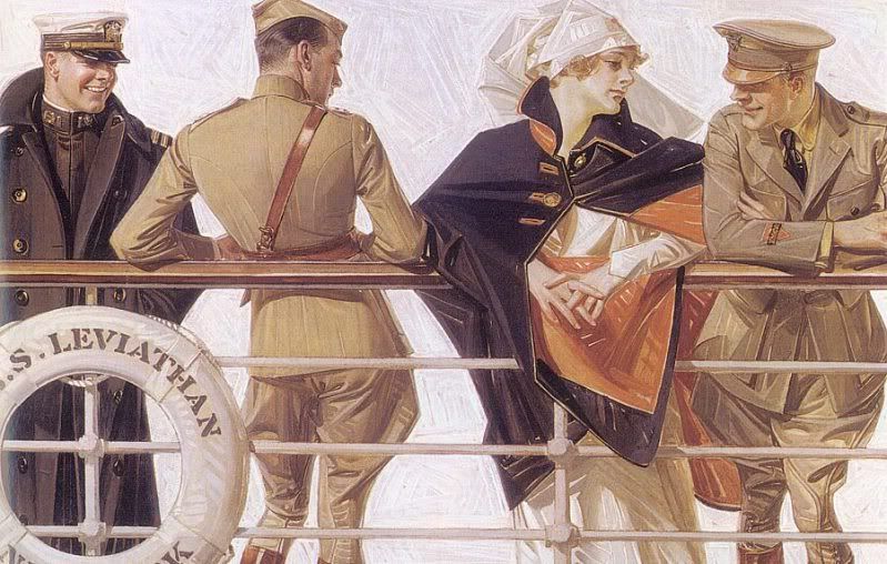 |
| I think it's safe to assume that at least two of those soldiers are not remotely interested in the nurse. |
There's a definite element of homoeroticism in a lot of Leyendecker's illustrations, although I have to wonder how much of it was ever picked up on by the general population circa 1905/1920/etc. Most of the time it's rather coy, like the picture above, although occasionally you get adverts that to the modern eye seem entertainingly obvious:
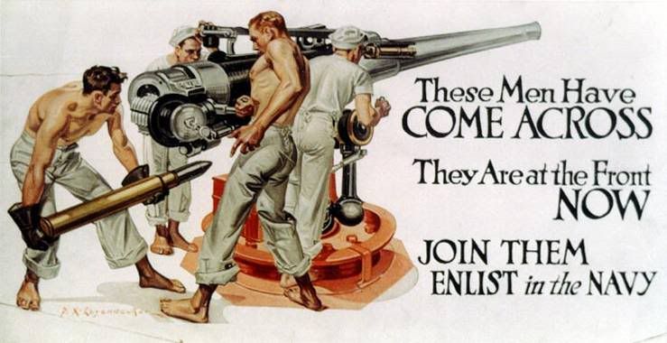 |
| It's like he was going for "world's most phallic advert" award or something. |
I mean, what is THAT? "Join the Navy, where glistening, shirtless men thrust huge missiles into waiting holes"? And there's more:
I'm going to go ahead and assume that Leyendecker never had much experience with the military, because these guys are basically Chippendales. It makes me feel a little bad for the small number of guys who looked at these posters, thought, "Hell, yeah!" and were then sorely disappointed by the realities of military life in the 1930s.
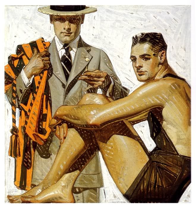 |
| o rly? |
But it's not just a "Leyendecker was gay so he drew a bunch of hot men" thing, I don't think, because he was being hired consistently for this work, meaning that
not just gay dudes were buying the products he helped advertise. Arguably the Arrow Shirts could have been marketed directly at women buying for their husbands, but Leyendecker's magazine covers and other adverts weren't. To me it indicates that Leyendecker's men (and the men of early 20th ads in general, although to be honest I don't know much about this) aren't just objects of desire, they're meant to be enviable, and to be emulated. Much like women in modern ads.
It's no secret that practically everything these days is sold using a hot, frequently half-naked woman, because in theory either you're going to associate sex-appeal with the product (straight men) or you're supposed to want to buy the product in order to gain sex-appeal (women). Leyendecker's men aren't the men of modern ads -- they're admirable, but they're also intentionally desirable. They're paragons of gentlemanly style and sportsmanship. They're a far cry from the
Lynx/Axe body spray dudes -- probably an unfair comparison, but you get what I mean. All ice-cream ads in 2011 are women orgasming over the sheer gloriousness of ingesting £2.50's-worth of processed frozen chocolate, whereas a Leyendecker ad for ice-cream in 1911 would probably be two hearty chaps at the tennis court holding ice-creams and looking like they're in the middle of a discussion about tie-pins, the German Problem, or stock options.
 |
| JUST CHILLAXIN' HERE IN MY GOLFING UNDERWEAR... |
Check out this sock ad. First of all:
sock ad. Obviously it's charmingly archaic by our standards, especially the snappy slogan ("The most extensively sold make of Men's Half Hose in existence"). This is
not the way to advertise socks in 2011. Socks are functional; sock ads in 2011 are functional. Men only get to be sexy if they're driving a new car or using a new shaving product, and then it's the
product that's sexy, not the man. But I think we can all agree that the socks are not what makes this image awesome.
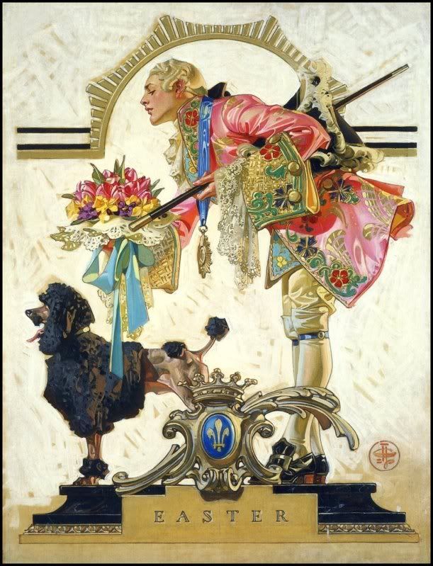 |
| Nothing says "Easter" like an 18th century French courtiere and a poodle. |
What really cracks me up is when Leyendecker's bosses give him creative control. If you google-image his art you get just as many magazine covers as adverts, and most of those magazine covers are totally impossible to parse. He seems to enjoy historical themes, but not usually for any... relevent reason...
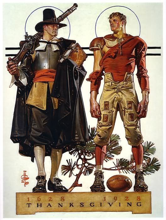 |
| Of course this picture represents Thanksgiving. OF COURSE. |
Actually, looking at the Thanksgiving picture above, I can help thinking that 1920s American football uniforms are sort of steampunk. I would so totally wear that! Then again, I'd probably also wear the courtier outfit as well, so long as you removed some of the lace.
I looked at this magazine cover for a good thirty seconds trying to work out what news story it could possibly be supposed to represent. Maybe there was an article about sports and/or rowing in the magazine somewhere? All I know is, most weekly papers no longer feature oiled-up men in short-shorts on the cover.
 |
| You know you'd watch this movie in a shot. |
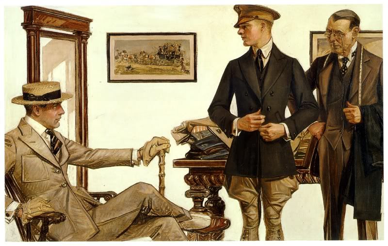
Despite the fact that most of Leyendecker's paintings are very obviously posed scenes, I find it much easier to imagine a narrative for them than I can for modern adverts/fashion spreads. Possibly this can be put down to me being a pleb who finds it easier to interpret "art" in a painting rather than a photograph, but I think it's more likely thanks to the expressiveness of the models. Take this current Michael Kors ad:
Scene: personality-free mannequins having fun in a bar while being stunningly attractive yet oddly expressionless. Compared to the next scene: the similarly everyday scenario of people buying clothes (albeit buying clothes from a professional tailor in 1910), but in this case the characters seem to be imbued with 100% more human warmth despite being painted rather than acted out by professional models. I don't know if this picture tells a thousand words, but it certainly has more of a story to it than the Michael Kors ad.
 |
| N.B. I think the man on the far right is Giles from Buffy. |
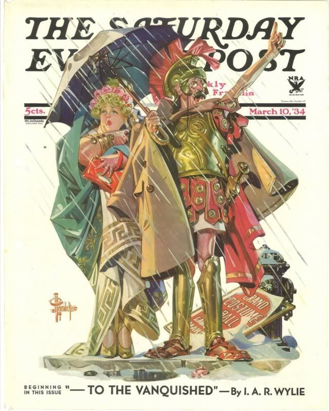
Quite apart from the whole female gaze/male gaze thing, I rather love Leyendecker's love of unnecessary costuming. Check out this newspaper cover:
I bookmarked this as "Mr and Mrs Weasley roleplaying as Naughty Maid and Sexy Centurion". I think Leyendecker just wanted an excuse to draw some Roman armour because it was March and it was chilly and he was being paid for this anyway so hey, why not? (
Why not?)
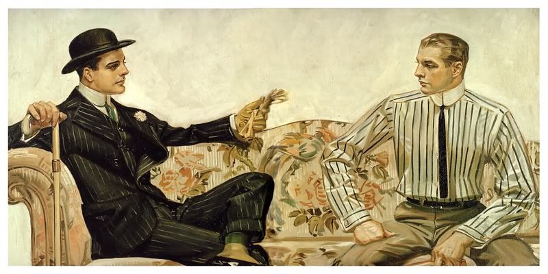
To finish, here's one of my favourite Leyendecker illustrations, another (quite early: 1907) Arrow Collar ad. I particularly love this one because of the variety of styles displayed in the lineup -- two different (and very stylish!) businessman looks bookending the group, a woman with a riding crop, a young dandy out for a walk in his flat-cap, and the 1900s equivalent of a prepster. The woman I particularly like, of course. It's highly unlikely that the ad would be marketing to the women-who-wear-suits crowd (not exactly a big market in 1907, although I assume she is in fact wearing some type of riding outfit) but she's still there and looking badass.
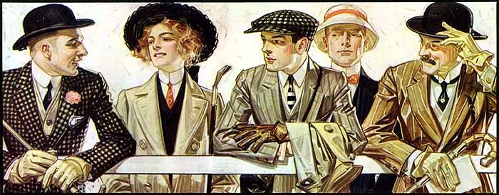 |
| The Arrow Collar Man, Virginia Woolf, Dorian Gray, Sebastian Flyte, and Dr John Watson. |


I. Love. This. I love your blog in general but this is my favorite thing ever. I'm totally stealing the Thanksgiving picture and sending it to all my Facebook friends tomorrow. :-)
ReplyDeleteOnline businesses need powerful platforms to sell products and manage customers efficiently. As an experienced ecommerce web design company, we create scalable online stores that help businesses grow in the digital marketplace.
DeleteOur ecommerce web designing company focuses on delivering secure, fast, and mobile-friendly websites that enhance the shopping experience and increase sales.
For more info: Web Founders USA
PS I think the young lady in the last picture looks just like Emma Watson, and now I would like there to be a movie where they all do a heist or something.
ReplyDeleteOne of my favourite illustrators! Why were there more hot guys back in those days? Ha ha ha!
ReplyDeleteI just love the way he painted the white backgrounds!
To me it indicates that Leyendecker's men...aren't just objects of desire, they're meant to be enviable, and to be emulated.
ReplyDeleteThere is also the possibility that men who identified as straight were still responding to the sexual images in those adverts far more than they realised.
Are you getting a sudden urge to join the Navy? Or just buy more shirts?
ReplyDeleteALL THE HOT GUYS WERE LEYENDECKER'S BF over and over again. :)) the Dinotopia illustrator actually reminds me a lot of leyendecker!
ReplyDeletemaybe a little emma watson around the eyebrows? i don't really see it though, i'm afraid. BUT i am always in favour of heist movies for sure. especially when they involve suits.
ReplyDeletethank you so much! :))
ReplyDeleteThe Arrow Collar Man, Virginia Woolf, Dorian Gray, Sebastian Flyte, and Dr John Watson.
ReplyDeleteOMG. That is *so* Sebastian. Wheeeee! I think what i love most about his work - well, besides how gorgeous it is, and how elegant, and how slyly sexy - is how everything is so *crisp*. Even the collie's fur is cross-hatched and sharply defined, rather than 'fluffly'. And I love the little squares and lines of nearly-pure white that make highlights, particularly in the one you tagged with 'o, rly'.
The lushness of the French courtier! I adore that coat - i'd wear it in a heartbeat. AND the hat. And probably the breeches. Plus i want the flowers.
*happy sigh*
:)
This guy's one of my biggest inspirations. *_* The hot guys, I mean the swift brush strokes color contrast...
ReplyDeleteEven though illustration ads are less mainstream today, at least there's the internet. :D I'm so happy you featured this guy.
:)) Leyendecker seems to be even more well-loved than I already thought! I've had a bunch of comments on twitter, tumblr etc about how much people love his art.
ReplyDeletei LOVE the crisp suits so much, dude. :(( I WANT IT ALLLLL.
ReplyDeleteCompared to the next scene: the similarly everyday scenario of people buying clothes (albeit buying clothes from a professional tailor in 1910), but in this case the characters seem to be imbued with 100% more human warmth despite being painted rather than acted out by professional models. I don't know if this picture tells a thousand words, but it certainly has more of a story to it than the Michael Kors ad.
ReplyDeleteThat's probably my favourite Leyendecker painting for the very reason that it DOES tell such a story (to me). On the face of it, it's a gentleman having one of his servants -- presumably a chauffeur -- outfitted, but then you start to think about the fact that he goes to such expense to have a servant look so nice, etc. And, well, the way he's gazing at the man, the intensity in both his eyes and his posture, implies other things, too. ;)
Definitely. There's always so much subtext in Leyendecker's art. Text, really... I hadn't even considered the chauffeur option for that picture, I was basically just assuming it was his boyfriend. ;) I mean, the dude in the chair is SO admiring/judging in that picture, for sure.
ReplyDeleteGreat blog! I was just doing some research on 1920's/30's fashion and came across your polst about Leyendecker--had never heard of him and now am a big fan! I totally want to start collecting his work, now!
ReplyDeletewww.rashadschiccritique.blogspot.com
This article is excellent. I just came across your blog today and have spent the last three hours pouring through the archives. Keep up the great work!
ReplyDeleteThe group of strapping lads is a rowing team carrying their racing shell after a victory. It was a popular college sport in the early half of the century and produced a very physically fit body.
ReplyDeleteArthur and Molly are dressed in Roman garb for the Ides of March. The date of the post shows that it will occur that week.
The young lady in the last illustration is wearing a tailor-made dress, very popular among working women, suffragettes, nannies and governesses. It implied a can-do no-nonsense personality and a rebellious spirit. They also could be worn with men's accessories, such as the detachable collars and ties that Arrow sold. They'd simply have to buy the size intended for teens or children.
ReplyDeleteشركة تنظيف مجالس بالرياض
شركة تنظيف سجاد بالرياض
شركة كشف تسربات بالرياض شش
شركة نقل اثاث بالرياض
شركة تنظيف خزانات 1
شركة تنظيف خزانات 2
شركة تنظيف خزانات 3
شركة تنظيف مكافحة حشرات بالرياض
Hi everyone,
ReplyDeleteI'm so excited my husband is back after a break up with the help of a powerful & genuine spellcaster called Dr.Unity.
When my husband broke up with me i was so frustrated and i could not know what next to do again, i love my husband so much but he was cheating on me with another woman and this makes him broke up with me so that he can be able to get marry to the other lady and this lady i think us witchcraft on my husband to make him hate me and my kids and this was so critical and uncalled-for,I cry all day and night for God to send me a helper to get back my man until i went to NY to see a friend and who was having the same problem with me but she latter got her Husband back and i asked her how she was able to get her husband back and she told me that their was a powerful spell caster in Africa name Dr.Unity that he help with love spell in getting back lost lover back, and i decided to contacted the same Dr.Unity and he told me what is needed to be done for me to have my man back and i did it although i doubted it but i did it and the Dr told me that i will get the result after 48hours, and he told me that my husband was going to call me by 9pm in my time and i still doubted his word, to my surprise my husband really called me and told me that he miss me so much, Oh My God! i was so happy, and today i am happy with my man again and we are joyfully living together as one good family and i thank the powerful spell caster Dr.Unity of Unityspelltemple@gmail.com, he is so powerful and i decided to share my story on the internet that good spell casters still exist and Dr.Unity is one of the good spell caster who i will always pray to live long to help his children in the time of trouble, if you are there and your lover is turning you down, or you have your husband moved to another woman, do not cry anymore contact the powerful spell caster Dr.Unity on his email: Unityspelltemple@gmail.com or call him on +2348072370762. if you have any problem contact Dr.Unity i guarantee you that he will help you and i am Katy Brown by name, I reside here in Silver Springs Florida. My residential address is as follows. 7008 E Hwy 326 Silver Springs Florida 34488, United States.
معلمة سودانيه خبرة 5سنوات كبير ه متابعة وتحفيظ قران بالرياض قرطبه مخرج8و7
ReplyDeleteI have been looking for this kind of information for quite a long time, a post that is more so full of imagination and creativity. I have to admit that you have done an impeccable thing by sharing this kind of a post. Thank you and kindly share more as i revisit. Thanks
ReplyDeleteCoursework Writing Help
شراء اثاث مستعمل بالرياض
ReplyDeleteشراء الاثاث المستعمل بالرياض
محلات شراء الاثاث المستعمل بالرياض
ارقام الاثاث المستعمل بالرياض
حقين الاثاث المستعمل بالرياض
شراء اثاث مستعمل
شركة مكافحة حشرات بجدة
مكافحة حشرات بجدة
شراء الاثاث المستعمل بجدة ومكة
شراء اثاث مستعمل بالرياض
شركة شراء اثاث مستعمل بالرياض
أعزائنا العملاء ، يمكنكم شراء الاثاث المستعمل بالرياض من خلال متخصصين بشراء الاثاث المستعمل ، حيث نحن قادرين على شراء الاثاث المستعمل لديكم بأعلى الأسعار الممكنة فلدينا خبرة في شراء الاثاث المستعمل تمتد لدى أكثر من عشرون عاما في مجال المتاجرة بالاثاث المستعمل وإعادة تدويره مره أخري بعد صيانته وتنظيفه وإصلاح كافة عيوبه ، كلا منا يحتاج في بعض الأوقات إلى تغيير الديكور الخاص ببيته ليس فقط لديكور المنزل من حيث الشكل وإنما أيضا نحتاج إلى تغيير ديكور الاثاث لدي منازلنا ، وهنا يقع صميم عملنا حيث نقوم نحن بعض التواصل مع أحد مندوبينا بمعاينة الاثاث لديك والتواصل معك لأعلى سعر ممكن لبيعه ثم نقوم باصلح كافة العيوب المتواجدة بالاثاث وإعادة عرضه مرة أخرى لدينا في محلات شراء الاثاث المستعمل بالرياض وخصيصا بالحراج
شركة تنظيف بأبها
ReplyDeleteشركة تنظيف فلل بأبها
شركة تنظيف شقق بابها
شركة تنظيف منازل بأبها
شركة تنظيف مجالس بابها
شركة ننظيف موكيت بأبها
شركة تنظيف خزانات بأبها
شركة نقل أثاث بأبها
شركة الصفرات لمكافحة الحشرات بالرياض
ReplyDeleteشركة الصفرات لرش المبيدات بالرياض
شركة تنظيف خزانات بجدة
ReplyDeleteشركة تنظيف شقق ممتازة بالرياض
شركة تنظيف فلل وقصور ممتازة
شركة تنظيف مجالس بالرياض بالبخار
شركة تنظيف منازل مجربة بالخرج
شركة تنظيف منازل بالرياض عمالة فلبينية
ReplyDeleteشركة تنظيف واجهات حجر بالرياض
شركة تنظيف واجهات زجاج ممتازة بالرياض
رش مبيدات بالرياض مع الضمان
اسعار شحن العفش للاردن
تركيب باركيه بالخرج
ReplyDeleteتنظيف بيوت شعر بجدة
تنظيف مدارس بالرياض
تنظيف بيوت شعر بالخرج
مكافحة العقارب بالرياض
شركة مكافحة الثعابين غرب الرياض
thank you I really appreciate it
ReplyDeleteشركة تنظيف بالاحساء
شركة مكافحة حشرات بالاحساء
شركة تنظيف كنب بالدمام
شركة كشف تسربات المياه بالاحساء
شركة القوة
موقع معلومة
شركة الصفرات للتنظيف بالرياض
ReplyDeleteشركة مكافحة حشرات بجازان
ReplyDelete+++++++++++++++++++++++++
معلم جبس بجدة
إن معلم جبس بجدة يصمم أحدث أعمال الجبس و تغطية جميع مناطق جدة و عمل ديكور جبسون بورد و دهانات و أصباغ ورق جدران بتصميمات عالمية لجميع الجنسيات متوفرة كما لدينا مهندسة ديكور لجميع اشكال الجبس بورد كما نقوم بجميع أعمال تركيب قواطع جبس بورد بأفضل المعدات و الأدوات الحديثة وبأقل التكاليف بإحترافيه و إبداع اتصل بمعلم جبس بجدة .
Power Company is considered one of the best cleaning companies in Dammam and the Eastern Province in the Kingdom of Saudi Arabia, and the company has a team of workers who have extensive experience in various cleaning, sterilization and pest control operations, and we in the company work various services with the best possible tools imported from abroad in order to ensure the best service Possible for our clients.
ReplyDeleteشركة تنظيف بالاحساء
شركة مكافحة حشرات بالاحساء
شركة كشف تسربات المياه بالاحساء
شركة تنظيف كنب بالدمام
شركة القوة
شركة تنظيف خزانات بالاحساء
شركة تنظيف خزانات بالدمام
ReplyDeleteشركة الوفاء
شركة مكافحة حشرات بالدمام
شركة تنظيف بالدمام
شركة تنظيف سجاد بالخبر
شركة تنظيف بيوت بالدمام
شركة تنظيف المنازل بالدمام
شركة تنظيف سجاد بالدمام
شركة تنظيف فلل بالدمام
تنظيف مجالس بسكاكا
ReplyDeleteتنظيف كنب بسكاكا
تنظيف خزانات بسكاكا
تنظيف شقق بسكاكا
تسليك مجاري بسكاكا
مكافحة حشرات بسكاكا
نقل عفش بسكاكا
عزل خزانات بسكاكا
عزل اسطح بسكاكا
كشف تسربات بسكاكا
غسيل مكيفات بسكاكا
cami avizesi - no deposit bonus forex 2021 - takipçi satın al - takipçi satın al - takipçi satın al - takipcialdim.com/tiktok-takipci-satin-al/ - instagram beğeni satın al - instagram beğeni satın al - google haritalara yer ekleme - btcturk - tiktok izlenme satın al - sms onay - youtube izlenme satın al - google haritalara yer ekleme - no deposit bonus forex 2021 - tiktok jeton hilesi - tiktok beğeni satın al - binance - takipçi satın al - uc satın al - finanspedia.com - sms onay - sms onay - tiktok takipçi satın al - tiktok beğeni satın al - twitter takipçi satın al - trend topic satın al - youtube abone satın al - instagram beğeni satın al - tiktok beğeni satın al - twitter takipçi satın al - trend topic satın al - youtube abone satın al - instagram beğeni satın al - tiktok takipçi satın al - tiktok beğeni satın al - twitter takipçi satın al - trend topic satın al - youtube abone satın al - instagram beğeni satın al - perde modelleri - instagram takipçi satın al - takipçi satın al - instagram takipçi satın al - betboo
ReplyDelete
ReplyDeleteيركز شباب اليوم بشكل عام على الإلكترونيات والأدوات. حتى الجيل الذي أتى بهم إلى هذا العالم دخل إلى حد كبير في أجهزة الكمبيوتر والإنترنت كجزء من الوظائف. وبالتالي ، فإن الأشخاص الذين يعرفون كيفية العناية بسياراتهم هم عدد قليل نسبيًا. غسيل السيارة ليس سوى جزء صغير من صيانة السيارة. إن الاهتمام بسيارتك عن طريق القيام بجزء من الصيانة الموصى بها بدلاً من قيام الوكيل بذلك لا يساعده حقيقة أن السيارات أصبحت أكثر موثوقية في الوقت الحاضر. كما أنه لا يساعد أيضًا أن أسلوب الحياة السريع اليوم لا يمنح الناس الوقت للقيام بكل ما يريدون. مع توقف أسبوع العمل ، يوم السبت المخصص للأعمال المنزلية ويخصص يوم الأحد لقليل من وقت الفراغ مع الشريك أو العائلة ، ماذا؟ غادر ليقوم بصيانة السيارة الأساسية؟ من الأسهل بكثير تركها في متجر أو التاجر ثم تمريرها في طريق العودة إلى المنزل ، أليس كذلك؟ هذا كله صحيح. لكنك ستكون جاهلاً مثل الطفل عندما يحدث خطأ ما في وقت غير مناسب. والمال الذي تنفقه على تكاليف العمالة من خلال القيام بالأشياء السهلة بواسطة محترف سوف يفاجئك.
بصرف النظر عن توفير الكثير من المال على تكاليف العمالة ، فإن إجراء الصيانة الأساسية للسيارة يسمح لك بالحفاظ على سيارة صالحة للسير على الطريق والتغلب على الإخفاقات الوشيكة قبل أن يلحقوا بك. حتى إذا كنت تأخذ سيارتك بشكل ديني إلى متجر أو تاجر ، فقد تتعطل أجزاء مثل الأحزمة أو الخراطيم أو الأحذية ذات الوصلات الكروية أو حتى الموصلات قبل الأوان. إذا اكتشفت وجود حزام تآكل أو تسرب صغير من خرطوم ، فيمكنك على الأقل أن تفعل شيئًا حياله قبل أن يتركك هذا العيب الصغير عالقًا على الطريق. وهل تحتاج حقًا إلى ميكانيكي محترف لفحص السوائل لديك مثل مستوى سائل التبريد أو سائل الفرامل أو زيت المحرك؟ وفر المال واشتر لنفسك بيرة.
هناك ميزة أكثر قتامة أيضًا لمعرفة أساسيات صيانة السيارات ، يجب الاعتراف بالحقيقة أن هناك عددًا من المتاجر والميكانيكيين الذين يسمون صناعة صيانة السيارات بسمعة سيئة. لكل تاجر أو متجر خدمة يقدم خدمة ممتازة ومهنية ، هناك أولئك الذين يحاولون زيادة تكلفة العملاء بقدر ما يستطيعون ، وفي بعض الأحيان يتقاضون رسومًا مقابل الوظائف التي لم يتم القيام بها على الإطلاق. وفي بعض الأحيان ، قد تفقد حتى أفضل المتاجر التي تتمتع بالدوافع والمهارة والإدارة الجيدة بعض الصيانة الوقائية اللازمة أو الفحص التشخيصي. هذا هو المكان الذي تكون فيه معرفة سيارتك في متناول اليد ، حيث يمكنك التحدث بنفس اللغة مع ميكانيكي فيما يتعلق بالأشياء التي يجب القيام بها لسيارتك. التعرف على أساسيات صيانة السيارة سهل. هناك الكثير من مقاطع الفيديو على YouTube والتي يمكن أن توضح لك كيفية القيام بذلك. وتوجد منتديات على الإنترنت لكل سيارة تقريبًا. تعد هذه المنتديات بمثابة منجم ذهب للمعلومات حول سيارات معينة ، وما هي الإخفاقات الشائعة ، ونوع كفاءة الوقود التي يمكنك توقعها ، وحتى مدى احتفاظ سيارتك بقيمتها. مع القليل من الوقت والسلوك ، لا يوجد سبب يمنعك من القيام ببعض الإجراءات الأساسية لصيانة السيارة بنفسك.
صيانة مرسيدس
صيانة بي ام دبليو
صيانة رنج روفر
https://arabaso.com/
ReplyDeleteتعتمد طرق العمل المحددة على طبيعة الاستخدام المطلوبة. التزامنا بالجودة ورضا العملاء لشركتنا تأسست أكثر من 25 عامًا من الخبرة في السوق الدولية في المضخات الكهربائية. هناك العديد من التطلعات التي تخدمها هذه المضخات نظرًا لوجود العديد من الأنواع المتاحة اليوم. عادة ما يكون منتجنا جاهزًا لتلبية احتياجات العملاء من خلال القبول المهني وروح الابتكار. لاحظنا من قبل المشترين والمنافسين في جميع أنحاء العالم كشركة رائدة.
أنواع المضخات المختلفة ومميزاتها: -
المضخة الغاطسة عبارة عن جهاز يحتوي على محرك محكم الإغلاق مرتبط بجسم المضخة. يستخدم هذا ضغطًا مباشرًا لدفع السائل عبر الأنبوب أو الخرطوم ، بدلاً من استخدام طريقة الاستهلاك.
مزايا-
إنه مصمم كوحدة مغلقة بإحكام ، مع غطاء مانع لتسرب الماء وموانع تسرب تحافظ على السائل بعيدًا عن الهيكل والمكونات الداخلية. تعمل هذه الميزة على تعزيز عدم تسرب المضخة أو قصرها كهربائيًا عند غمرها. يعني استخدام الضغط المباشر أن المضخة يمكنها نقل السوائل لمسافة أكبر بكفاءة أكبر من أجهزة الشفط. تتطلب الأنواع الأخرى من المضخات الاستعداد لبدء التشغيل. التحضير غير مطلوب لبدء تشغيل المضخة الغاطسة.
كيف تعمل مضخة الطرد المركزي؟
يسمح الفراغ الجزئي لضغط الهواء الأرضي بإجبار الماء على أعلى الأنبوب في جانب الشفط للمضخة لاستبدال الماء المزاح. عندما يصطدم الماء بالدفاعة الدوارة ، يتم نقل الطاقة منه إلى الماء ، مما يجبر الماء على الخروج.
مزايا-
أكبر ميزة لهذه الأنواع من المضخات هي بساطتها السابقة. لا تتطلب أي صمامات أو أجزاء متحركة كثيرة. هذا يجعل من السهل إنتاجها باستخدام العديد من المواد المختلفة. كما يسمح لهم بالتحرك بسرعات عالية مع الحد الأدنى من الصيانة. إنتاجهم ثابت ومستمر للغاية. معظمها صغير جدًا مقارنة بالأنواع الأخرى من المضخات التي تولد نفس الإخراج.
مضخة الضغط: هذه آلة تزيد من ضغط السائل. يمكن استخدامها مع السوائل أو الغازات ، لكن تفاصيل التكوين ستختلف اعتمادًا على المائع.
مزايا-
وحدة تحكم دائمة في القيادة تراقب تلقائيًا نظام ضغط الطلب في منزلك من خلال العمل بتردد متغير. يعمل محرك التردد المتغير على تسريع أو إبطاء مضخة الضغط اعتمادًا على متطلبات المياه المنزلية مثل مثبت السرعة في السيارة.
التثبيت والخدمات المخصصة التي نوفرها: -
نحن نقدم حلولاً جاهزة لتلائم متطلبات عملائنا ، أو لتعقيد الحل ، أو مكان استخدامه أو حجمه. يتوفر دائمًا قسم الخدمات الفنية والمهندسون المؤهلون بالقدرة على التعامل مع المشاريع الكاملة ، بما في ذلك التركيبات الميكانيكية والكهربائية. نحن ملتزمون بتقديم ملاحظات ضخ فريدة من مجموعة مصادر عالمية من التقنيات المبتكرة والمتطورة. نحاول دائمًا التطوير لإنتاج وبيع وخدمات حلول المضخات عالية الجودة ووضع المعايير في الصناعة.
Wastewater
مقوي ضغط الماء
Pressure Boosting
Irrigation and agriculture
al-wabel
نادرًا ما يكون الخير الكافي جيدًا ولن يكون رائعًا أبدًا. يحدث الشيء نفسه عندما يتم إصلاح سيارتك في متجر مرآب غير جيد وتعاني لاحقًا من العواقب. تحتاج سيارتك إلى رعاية ميكانيكي مسؤول ومزود خدمة سيارات موثوق به. تقوم Fixions بكل ذلك من خلال خدمات صيانة السيارة.
ReplyDeleteتتيح لك Fixions الخدمات التالية على عتبة داركم ببضع نقرات:
الخدمة العادية: احصل على خدمة سيارتك الدورية من خلال شبكة Fixions لمتاجر المرآب الموثوقة. تم إدراج مزودي الخدمة هؤلاء في شبكات Fixions بعد التحقق والاختبار الكاملين لقدرتهم على تقديم خدمة عالية الجودة لعملاء Fixions.
بينما قد لا تتحدث سيارتك ، لا تزال بحاجة إلى فهم الوقت المناسب لخدمتك التالية. اختر إصلاحات لابتسامة سيارتك.
إصلاح مشكلة معينة: إطار السيارة مثقوب أم ترى تسربًا في المحرك؟ تحتاج خدمة غسيل السيارات على وجه التحديد؟ أخبر Fixions عن الخدمة المحددة التي تحتاجها واحصل عليها في الوقت والمكان المناسبين لك. إذا لم يكن لديك متسع من الوقت لزيارة متجر مرآب ، فيمكن لمتجر المرآب أيضًا توفير خدمات الاستلام والتوصيل لسيارتك.
يحدث معنا أننا غير راضين عن الإصلاح الذي يقوم به متجر المرآب على جانب الطريق ومحاصيل المشكلة تتكرر مرارًا وتكرارًا على فترات متكررة. مع Fixions ، أنت مطمئن إلى الخدمة الواعدة وأفضل الفنيين الموجودين تحت تصرفك.
التفتيش بحثًا عن مشكلة: تسمع صوتًا غريبًا يخرج من مكان ما داخل السيارة لكنك لا تفهم ما هو بالضبط. لا تتجاهل مثل هذه المواقف وقم بفحصها حتى لا تصبح المشكلة كبيرة بعد بضعة أيام.
يمكن لمقدمي خدمة المثبتات مساعدتك في اكتشاف المشكلة بدقة وإيجاد الحل المطلوب.
يتم توفير جميع الخدمات المذكورة أعلاه بأسعار معقولة. وبغض النظر عن الأسعار ، فإنه يوفر سلة مليئة بالراحة والراحة لإنجاز العمل. خدمة السيارة مهمة للغاية وبدلاً من البحث عن أعذار لعدم الحصول على وقت كافٍ لإنجاز خدمة السيارة ، استخدم الخدمات الذكية من Fixions وابق في صدارة رحلتك.
قطع غيار بي ام دبليوالرياض
قطع غيار بنتلي الرياض
قطع غيار بورش الرياض
ورشة اصلاح سيارات
تدفق سائل الفرامل
ReplyDeleteهناك احتمال أن السائل يطور الرطوبة مع مرور الوقت داخل نظام الكبح. يجب أن يكون السائل في حالة جيدة حتى تعمل الفرامل بشكل صحيح. يمكن أن يؤثر السائل السيئ على أداء السيارة وقد تتآكل المكونات الأخرى بسبب ذلك. يوصى بغسل السائل كل عامين. سوف يتسبب شطف السائل في عمل السيارة بشكل صحيح مرة أخرى. يميل الكثير من الناس إلى تجاهل هذه الخطوة أثناء الصيانة ، لكنها مهمة.
دوران الإطارات
دوران الإطارات ضروري لكي يعمل إطار سيارتك بشكل صحيح. يتم تدوير الإطارات لتحقيق محاذاة مثالية لعجلة السيارة. يوصى بتدوير الإطار بعد كل 6000 ميل. ليس من الصعب أن تقوم بتدويرها بنفسك أيضًا. العناصر التي ستحتاجها هي جاك ومفتاح. يمكنك الاطلاع على الدليل عبر الإنترنت أو سؤال أي ميكانيكي عن الإجراء. من المهم أيضًا أن تقوم بتدوير إطارات سيارتك حتى تتآكل بشكل متساوٍ.
استبدال مساحات الزجاج الأمامي
تعتبر المساحات من أسهل الأجزاء التي يمكن استبدالها ولكنها تتلف بسهولة أيضًا. يمكن أن تتأثر بالأمطار الغزيرة أو تساقط الثلوج. إذا فشلت الشفرات في القيام بعملها المتمثل في مسح الزجاج الأمامي وتنظيفه وتركت علامة بارزة على الزجاج الأمامي ، فمن المحتمل أن تحتاج إلى استبدالها.
يمكنك الحصول على الجديد من أقرب متجر لقطع غيار السيارات. هناك أنواع مختلفة من الشفرات متوفرة بأسعار مختلفة. يمكنك اختيار تلك التي تعتقد أنها الأفضل بالنسبة لك. اتبع إجراءات التقسيط الموضحة على الحزمة خطوة بخطوة.
تغيير المبرد
سائل التبريد هو السائل الذي يمنع ارتفاع درجة حرارة مركبتك. يجب أن يكون عند مستوى معين حتى تعمل السيارة بسلاسة. إذا انخفض مستوى السائل ، يبدأ ارتفاع درجة حرارة السيارة ويصبح من الخطورة جدًا على السائق قيادة سيارة شديدة السخونة.
تحتاج إلى التحقق من مستوى السائل يوميًا وإذا كان منخفضًا جدًا فعليك إعادة تعبئته على الفور. إذا كنت تشعر أن المستوى ينخفض ??بشكل متكرر ، فمن المحتمل أن يشير ذلك إلى حدوث تسرب. يمكنك ملاحظة حدوث تسرب بسهولة حيث سيكون هناك سائل كثيف يتساقط من سيارتك. إذا حدث شيء من هذا القبيل ، فأنت بحاجة إلى تغيير الحشيات لأنها قد تتلف.
قطع غيار لامبورجيني
قطع غيار لكزس
قطع غيار مازدا
ورشة اصلاح سيارات
كيف تجد شركة تصميم الجرافيك المناسبة
ReplyDeleteصورة تساوي ألف كلمة
نعم ، إنها عبارة مبتذلة ولكن الصورة تنقل أكثر من نص. يعد عمل شركة تصميم هوية الشركة أو وكالة هوية العلامة التجارية أو شركة تصميم الشعار في الهند أمرًا مهمًا لأنه
تؤثر الصور المرئية للعلامة التجارية على تصورات العملاء عنها ، حيث تساعد في تحديد هويتها ، وتوصيل قيمها
يتم استخدام المحتوى المرئي - بدءًا من مقاطع فيديو YouTube إلى الرسوم البيانية - اليوم في مجموعة متنوعة من السياقات حيث يفضل المزيد والمزيد من الناس مثل هذا المحتوى
تعمل الرسومات الجيدة على زيادة المشاركة على وسائل التواصل الاجتماعي لأن معظم المنصات تعطي الأولوية للمحتوى المعتمد على الصور على الآخرين.
بدء البحث عن شركة تصميم جرافيك Rockstar
يمكن أن يكون اختيار شركة تصميم الجرافيك المناسبة من بين العشرات والعشرات المتاحة عملية محيرة وصعبة ، مما يترك المسوقين في كثير من الأحيان في حيرة من أمرهم.
تتمثل إحدى طرق تسهيل هذا البحث الصعب في توضيح الأشياء الثلاثة المهمة التالية قبل البدء:
مجال المشروع
توقعات فريق التصميم الجرافيكي (أسلوب التصميم ، المخرجات ، مستوى الدعم ، متطلبات الوقت)
قيود الميزانية / الوقت
بمجرد تعيين هذه العناصر بوضوح ، حان الوقت للبحث عن الخيارات ووضع قائمة مختصرة بالعناصر التي تبدو مناسبة. يمكنك
البحث على الإنترنت
اطلب مراجع من شبكتك أو
تحديد وكالات معينة من خلال عملها على العلامات التجارية الأخرى.
6 أشياء يجب النظر إليها أثناء البحث عن شركة تصميم الجرافيك المناسبة
ركز على هذه الجوانب الستة ، وستكون في طريقك لتحديد أفضل شركة تصميم جرافيك لك:
1. المحفظة
انظر بعناية في المحفظة وقم بتقييم نوع العمل المنجز. حاول تعيينه مقابل الموجز المطلوب. يمكن أن تكون جودة التنفيذ مؤشرًا جيدًا على المهارات الإبداعية للفريق وقدرته على التسليم.
ومع ذلك ، لا تقتصر فقط على الأمثلة المقدمة من قبلهم - ألق نظرة على موقع الشركة على الويب ، وتصفح قنوات التواصل الاجتماعي الخاصة بها - فمن المحتمل أن تحصل على لمحة عن نهجهم وأسلوبهم.
2. الخبرة الكافية
يعد العدد الإجمالي للسنوات التي تعمل فيها شركة التصميم الجرافيكي عاملاً مهمًا آخر. قد يكون الفريق ذو الخبرة أكثر فاعلية حيث قد يكون لديهم فهم أفضل وقد يكونون قادرين على تقديم مخرجات أفضل وأسرع بتكاليف أقل.
3. موضوع الخبرة
التصميم الجرافيكي مجال واسع. رسومات الوسائط الاجتماعية والشعارات وبطاقات العمل - يتطلب كل نوع مختلف من المخرجات مهارة متخصصة وقد لا يمتلكها الجميع. لذا حاول تحديد مدى الخبرة التي تتمتع بها شركة تصميم الجرافيك في مجال عملك ، ومشاريع التصميم المماثلة ، والأسلوب الذي تحتاجه وما إلى ذلك.
4. عملية العمل
لا تنس الاستفسار بشكل أعمق عن عملية عمل شركات التصميم الرسومية التي تقوم بتقييمها. يجب أن يركز نهج الشركة على فهم احتياجاتك وأن يظل مرناً مع امتلاك الخبرة لتحديك في حالة وجود أي خلافات.
5. الشهادات
اجعلها نقطة لطلب شهادات العملاء أو المراجع إذا لم يتم توفيرها. سيتم الاستفادة من عملية اتخاذ القرار الخاصة بك من خلال الاستماع إلى الشركات الأخرى التي عملت مع الفريق في وقت سابق. يمكنهم تقديم رؤى حول أسلوب العمل ومستويات الالتزام ومعايير التسليم.
6. نهج معقول للتسعير
من المنطقي أن تكون على نفس الصفحة فيما يتعلق بالميزانيات لأنها يمكن أن تكون عاملاً حاسمًا. ومع ذلك ، يجب أن تكون شركات تصميم الجرافيك شفافة في كيفية تسعير المشاريع وإظهار المرونة.
بالإضافة إلى ذلك ، تقع على عاتقنا مسؤولية إخبارك كيف يمكن أن يكلفك التصميم السيئ. فيما يلي نظرة مثيرة للاهتمام حول مدى تأثير التصميم السيئ على ميزانيات
شركة تصميم مواقع
خدمة اظهار موقعك في محرك البحث
اعلانات جوجل
خدمات التصميم والتسويق
شركه عزل فوم بالدمام
ReplyDeleteشركة تسليك مجاري بمكة
شركة رواد الحرمين الموقع الرائد فى عالم الخدمات المنزليه والاول بالمملكه العربيه السعوديه
في مجال كشف تسربات المياه بمكة وجدة
شركه كشف تسربات المياه بجدة
شركة كشف تسربات المياه بمكةا
I guess I am the only one who came here to share my very own experience. Guess what!? I am using my laptop for almost the past 2 years, but I had no idea of solving some basic issues. I do not know how to Crack Softwares Free Download But thankfully, I recently visited a website named Crackedfine
ReplyDeleteAvg Pc TuneUp Crack
Wirecast Pro Crack
Ableton Live Suite Crack
VueScan Pro Crack
NetBalancer Crack
شركه عزل فوم بالقطيف
ReplyDeleteشركه عزل فوم بالاحساء
شركه عزل فوم بالجبيل
شركة كشف تسربات المياه بمكةا
شركة تسليك مجاريبخميس مشيط
pop over to this site replica bags china moved here buy replica bags online click to read best replica designer
ReplyDeleteHi, did you know there are spells to win love back from an ex. I have done it. I love reading about relationships and how to make them work, how to better the relationship, and how to keep the spark alive, even how to talk to them a certain way to get them to think a different way about the situation and you. If you need advice or want to win your ex back, try DR EMU copy and message on the following ( Email: emutemple@gmail.com ) or ( WhatsApp: +2347012841542 ) It will change your mentality and get you what you want. Facebook page Https://web.facebook.com/Emu-Temple- 104891335203341
ReplyDeletenext page dolabuy news dolabuy discover here Dolabuy Balenciaga
ReplyDeleteyeezy shoes
ReplyDeletegolden goose francy
supreme
hermes outlet online
giannis shoes
GGDB
curry 8
ggdb
fear of god
kyrie 6
Reading more with interest. wonderful post Truly cool
ReplyDeleteReally happy about this. amazing article that is both valuable and educational. Wonderful work
ReplyDeleteCheck out our Bayport loans with flexible repayment terms." recruitment loans
ReplyDeleteThis was very interesting to read, and very educative and informative as well.. Great writup ...Keep it up!
ReplyDeleteGet back with Ex lover with the help of____________________( Dr.mac@yahoo. com ).
ReplyDelete1)Win lost lover back
2)Stop Divorce.
3)Save marriage/Relationship
4)Win ex boyfriend/girlfriend back
5)Fix relationship/marriage issues
6)Win Soulmate back.
7)Make Ex run after you
8)Return /reunite with Ex
9)Reclaim my lover
10)Make Ex husband/wife yours forever
I am so lucky that I've finally found this.
ReplyDeleteExcellent website you have here, so much cool information!
ReplyDeleteIn fact your creative writing skills has inspired me.
ReplyDeleteYou have great knowledge and expertise in writing such blogs.
ReplyDeleteIt’s so good and so awesome. I am just amazed.
ReplyDeleteIt’s a really good blog, but I’ve collected the best news. right here.
ReplyDeleteThanks to your writing, I am very happy to complete the process now.
ReplyDeleteI must say this was very helpful and easy to understand.
ReplyDeleteThis was a really great contest and hopefully I can attend the next one.
ReplyDeleteGOOD SITE
ReplyDeleteI've never seen such vibrant colors and intricate patterns in carpets anywhere else; Dubai truly knows how to showcase its heritage.
ReplyDeleteNilafar Du Nile creates fragrances inspired by ancient Egyptian aromas
ReplyDeletehi
ReplyDeleteLeyendecker’s work on the Arrow Collar Man perfectly captures the elegance and sophistication of early 20th-century advertising. His artistic influence is still felt in how brands craft their ideal image today. Interestingly, just like Leyendecker shaped perception through visuals, completing assignments like NURS FPX 4040 Assessment 1 helps shape our understanding of modern concepts in nursing and communication.
ReplyDeletefor more info :NURS FPX 4040 Assessment 1
This post was useful and easy to follow! This article of Click Speed Test really helped with practice. CPS Test provides timed clicking practice that helps users find the most effective technique while tracking progress with clear, immediate results on-screen after each session.
ReplyDelete